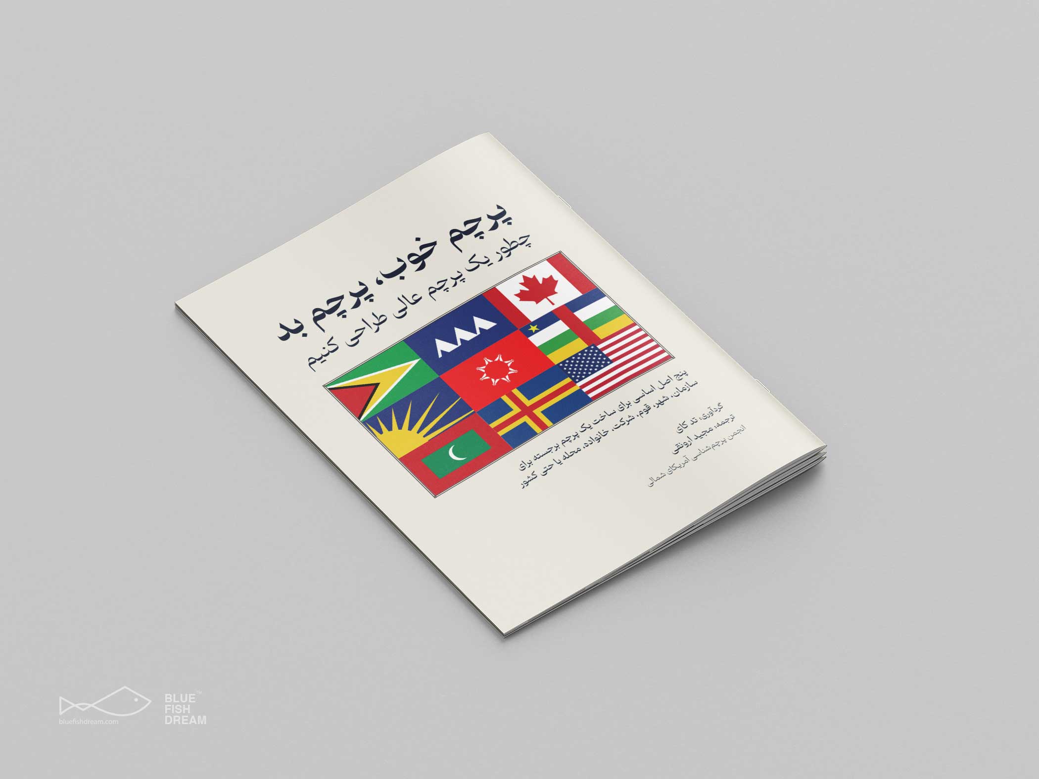
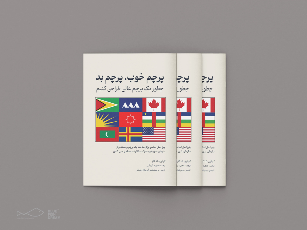
Good Flag, Bad Flag
During my research about flags, I came across a booklet on Nava‘s website (North American Vexillological Association), which seemed to me to be a practical guide. I realized that it doesn’t have Farsi translation, so I translated and re-layout it as a personal project. I think it’s a good start for those who want to work in flag design field.
“Good” Flag, “Bad” Flag, compiled by Ted Kaye from the expert wisdom of over 20 vexillologists/vexillographers, has become a classic resource for those wishing to design or re-design a flag. The booklet lays out five basic principles for good flag design, and then shows examples of flags that follow them and flags that disregard them, all illustrated in color.
You can use these five basic principles to create an outstanding flag for your organization, city, tribe, company, family, neighborhood, or even your country!
“Good” Flag, “Bad” Flag is not meant to be an in-depth look at flag design, but a quick reference and primer for anyone interested in vexillography or who wants to create a flag.
Good Flag, Bad Flag: How to Design a Great Flag
The Five Principles are:
- Keep It Simple. The flag should be so simple that a child can draw it from memory.
- Use Meaningful Symbolism. The flag’s images, colors, or patterns should relate to what it symbolizes.
- Use 2 or 3 Basic Colors. Limit the number of colors on the flag to three which contrast well and come from the standard color set.
- No Lettering or Seals. Never use writing of any kind or an organization’s seal.
- Be Distinctive or Be Related. Avoid duplicating other flags, but use similarities to show connections.
Of course there are exceptions to every rule, but depart from these five principles only with caution and purpose.